CMS Guide
Blog posts, publications, and the About page’s career history are meant to be edited through Decap CMS (formerly Netlify CMS), a browser-based admin panel that commits changes back to this GitHub repo — no local setup, no code editing required for routine content changes. It lives at /admin on the live site.
admin/config.yml — the real behavior you'll see once logged in.
Opening it
Go to https://nekarantanis.co.uk/admin/, sign in with GitHub when prompted, and you’ll land on a list of three collections: Blog Posts, Publications, and About Page. Four small icon-labeled buttons are pinned to the bottom-right corner of every CMS screen (admin/index.html): “Umami ↗” jumps to the analytics dashboard, “Cusdis ↗” jumps to the comments dashboard (for moderating/deleting comments on blog posts and publications), “Docs ↗” jumps to this documentation site, and “View site ↗” jumps back to the live site — all so you don’t have to hunt for a separate tab while editing.
Inside an individual Blog Post or Publication entry, there’s also a Preview link/button in the editor toolbar that opens that specific entry’s actual page on the live site in a new tab — not just Decap’s own in-app preview pane. It’s driven by site_url (top-level in admin/config.yml) combined with each collection’s preview_path. For an entry that hasn’t been published yet, that link 404s until it has been — expected, since the page doesn’t exist there yet.
For Blog Posts specifically, this link is built from the post’s title (auto-slugified), since the site’s actual URLs don’t include the date that’s in each post’s filename. That matches every post’s real URL from “Raising Standards Behind Walls” onward, where the filename slug is the full title — but a few older posts (e.g. “Making the SAR/QIP Cycle…”, whose file is sarqip-cycle.md) have shorter, hand-picked slugs that don’t match the title, so Preview will point to the wrong URL for those specific ones. Publications aren’t affected — their slugs are never date-prefixed.
How saving works: editorial workflow
admin/config.yml sets publish_mode: editorial_workflow, which means an edit doesn’t go straight to the live main branch the moment you save. Instead, Decap moves each entry through Draft → In Review → Ready, backed by a real GitHub pull request — so you can leave a post half-written, come back later, and nothing goes live until you explicitly publish it from the editor. This is the same GitHub permissions your own login already has; there’s no separate CMS-only auth level.
Locally, local_backend: { url: http://localhost:8082/api/v1 } lets you run the CMS against npx decap-server for testing without hitting GitHub at all.
decap-cms@3.14.1, in admin/index.html — not a floating ^3.0.0-style range. 3.15.0 crashes with a minified React error whenever an entry is saved under this config's editorial_workflow mode; bisected down to exactly that release, with 3.14.1 saving cleanly. A floating range would silently pick up 3.15.0 (or any future regression) again, so leave this pinned until upstream ships a fix.
Editing a blog post
Click Blog Posts → an existing post, or New Blog Post. The fields, top to bottom:
| Field | Widget | Notes |
|---|---|---|
| Title | text | |
| Date | datetime | Format locked to YYYY-MM-DD |
| Featured | boolean | Pins this post to the top of the Blog page instead of the grid. If left off everywhere (or checked on more than one post), the newest post wins. |
| Category | select | Fixed list — reuse an existing one where it fits, since it drives both the grid’s category filter and the grouped view in this same editor. |
| Icon | icon-picker (custom) | See below. |
| Card summary | text | Shown only on the Blog grid card, not the post itself. |
| Tags | list | Free-form; each becomes a clickable filter pill on the Blog page. |
| Body | markdown | The first paragraph renders larger, as the lede. A Markdown > blockquote becomes the large pull-quote style (and gets the typewriter effect on the live page). |
The post list can be grouped by Category and pre-filtered by two tags (view_groups / view_filters in config), purely to make a long post list easier to scan while editing — this has no effect on the live site.
Editing a publication
Click Publications → an existing entry, or New Publication. Entries live in _publications/*.md and render through _layouts/publication.html. The fields, top to bottom:
| Field | Widget | Notes |
|---|---|---|
| Title | text | |
| Year | number | Drives sorting and the “By the Numbers” year-range counter. |
| Byline | text | Natural reading order, e.g. “Nikolaos-Evangelos Karantanis, Leszek Rychlik, Anthony Herrel, and Dionisios Youlatos.” |
| Co-authors | list | Excludes yourself — feeds the “collaborators” stat on the Publications overview. |
| Species studied | list | Feeds the “unique species” stat. |
| Keywords | list | From the article’s own Keywords line; shown as this entry’s categories/filters. |
| Journal | text | |
| DOI URL | text | Optional. |
| Icon | icon-picker (custom) | Same widget as blog posts — see below. |
| Card summary | text | Shown on the Publications listing card. |
| Full APA citation | text | The complete, ready-to-copy APA 7th-edition reference-list entry. |
| Original PDF | file | Powers the “Download original PDF” button at the end of the article. |
| Featured image | image | Optional, not currently shown anywhere on the overview — reserved for future use. |
| Body | markdown | The transcribed article. ## headings (Abstract, Introduction, Methods, Results, Discussion, References, …) automatically populate the sticky on-page TOC — see Publication layout. |
Editing career history (About page)
About Page → Career Roles is a single YAML file (_data/roles.yml), not one file per company. Its roles list is nested: each entry is a company (with its own logo, subtitle, date range, and blurb), containing a list of positions held there. Every position has:
- a date range, title, and icon
- Primary — checked for the current/most senior role at that company, which renders as a highlighted box; leave unchecked for earlier roles at the same place, which render as a plainer sub-entry underneath
- bullets (the role’s actual responsibilities/achievements) and optional tags
The section field on each company (leadership / digital / research) determines which of the About page’s three jump-linked sections it appears under — it isn’t automatic from anything else, so pick it deliberately when adding a new company.
The icon picker
The post icon field, each position’s icon field, and the publication icon field all use a custom widget (admin/icon-picker.js) instead of Decap’s default dropdown, registered via CMS.registerWidget('icon-picker', ...). Rather than picking a name from a <select>, you get every icon laid out as a clickable grid — each tile shows the actual icon plus its label, so you can recognize the right one visually instead of guessing from a name:
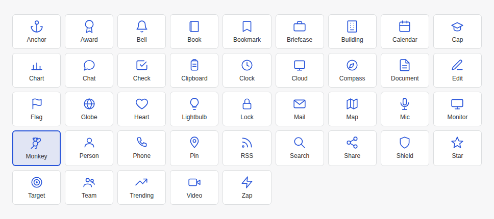
Clicking a tile calls the field’s onChange with that icon’s key (e.g. "tree"), which is exactly the string stored in the post/role/publication’s front matter and passed to <path d="M11.5 22 C10.5 17, 9.6 12, 9 4.8"></path><path d="M10.2 16 C12.5 15, 14.5 14.3, 16.5 12.5"></path><path d="M9.4 12 C7.5 11.6, 6 11.2, 4.5 9.5"></path><path d="M9.1 8.6 C11 8.1, 12.5 7.4, 14 6"></path><circle cx="9" cy="4.8" r="1.1"></circle><circle cx="16.5" cy="12.5" r="1.1"></circle><circle cx="4.5" cy="9.5" r="1.1"></circle><circle cx="14" cy="6" r="1.1"></circle> when the page renders — so the CMS widget and the live site are guaranteed to agree on what each name means, since _includes/post-icon.html and admin/icon-picker.js both hardcode the same set of keys pointing at the same SVG path data. If you ever add a new icon, add it in both places — the comment at the top of icon-picker.js calls this out explicitly.
The live preview
The right-hand preview pane, by default, would render Decap’s generic Markdown styling — not what the post actually looks like live. admin/preview.js fixes this two ways:
CMS.registerPreviewStyle(...)loads the real Google Fonts,bootstrap.min.css, andcustom.cssinto the preview iframe — the exact stylesheets the live site uses.CMS.registerPreviewTemplate('posts', PostPreview)replaces the default preview layout with one built from the site’s real classnames (section-dark-dotted,post-header-inner,post-body-inner, etc.) rather than approximated inline styles — so a dark header block with the title renders exactly as it will on the published page, with the same fonts, spacing, and pull-quote styling.
The custom preview template is currently only registered for the posts collection. Publications get the real stylesheets (so fonts/colors are right) but fall back to Decap’s generic default layout rather than a .pub-shell-accurate one — worth knowing so an odd-looking preview on a publication entry isn’t mistaken for a bug.
Media uploads
The default media folder is uploads/, but posts, publications, and role logos each override it to their own subfolder (/uploads/posts, /uploads/publications, /uploads/logos) via media_folder/public_folder on those specific fields — so images (and, for publications, the original PDF) stay organized by type rather than all landing in one flat folder. Existing role logos happen to live directly under uploads/ rather than uploads/logos/; that’s fine and won’t break anything, the override only changes where new uploads land.