Sections & Components
The site’s visual rhythm comes from a small set of section-level building blocks that get reused across every page: textured backgrounds, floating decorative “blobs,” animated wave dividers, and cards. None of them are page-specific — the same handful of classes assemble into the home hero, the About header, the Blog header, and every post header. This page covers each piece and, most importantly, how they’re meant to combine.
Section backgrounds
Five background classes give a section its base texture, all built the same way — a background-color plus a repeating background-image at 24px 24px, so every dotted, gridded, or crossed surface on the site shares one visual rhythm:
.section-dark-dotted   /* --nk-c0, white dots at 5% opacity — used for headers/CTAs */
.section-light-dotted  /* --nk-c3, dark dots at 3.5% — used for secondary content bands */
.section-white-dotted  /* --nk-c4, dark dots at 3.5% — About page's alternating sections */
.section-light-grid    /* --nk-c3, dark grid lines at 1.8% — Home's "By the Numbers" only */
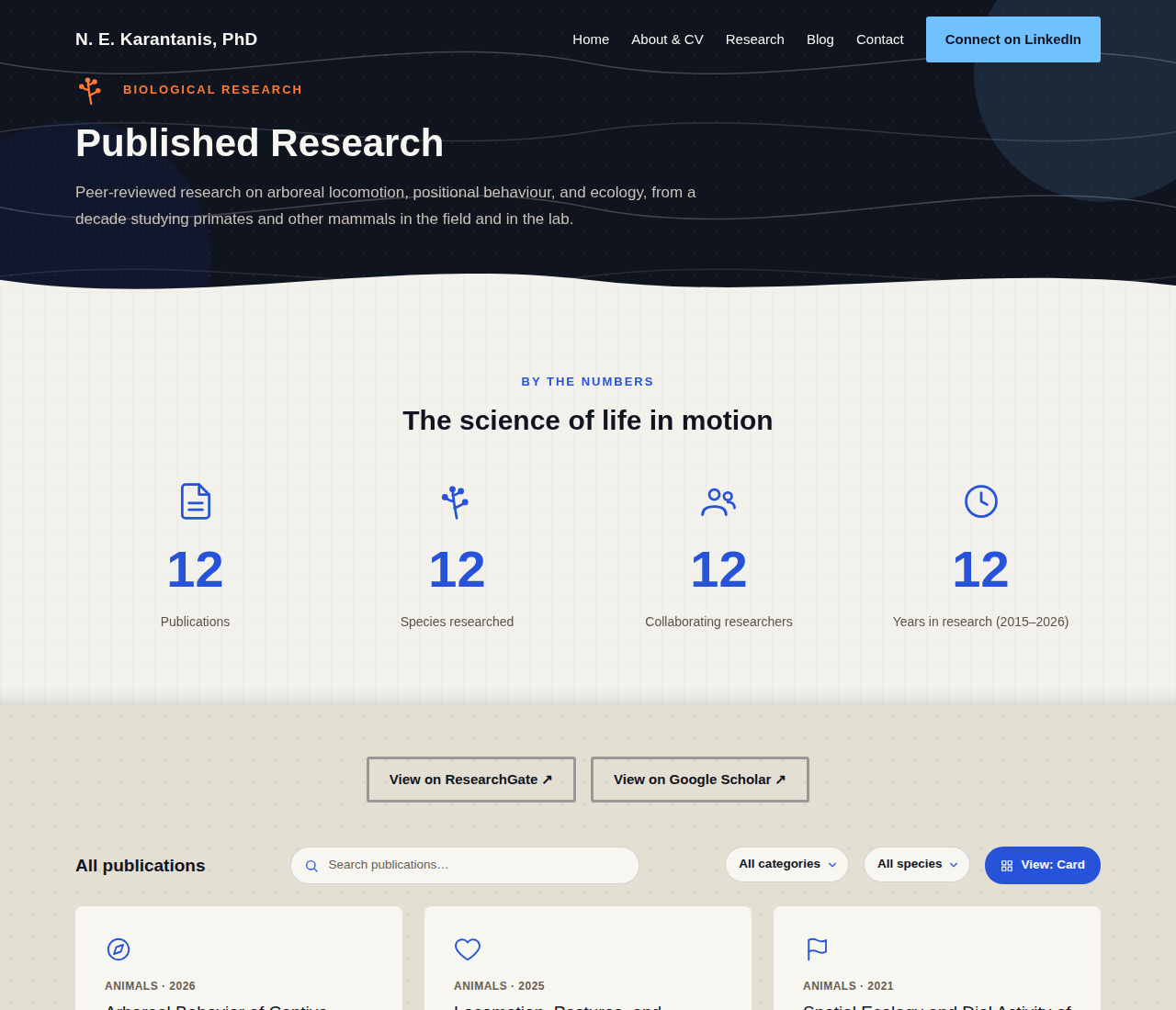
.section-light-crosses /* --nk-c3, small grey X marks at 6% — Research/Publications pages */
.section-light-crosses swaps the dot/grid pattern for discreet grey X marks and, like .dots-seamless below, carries no inset recess shadow — so a Publications page’s stacked light sections read as one continuous surface rather than a stack of distinct bands, matching the Blog page’s seamless dotted treatment.
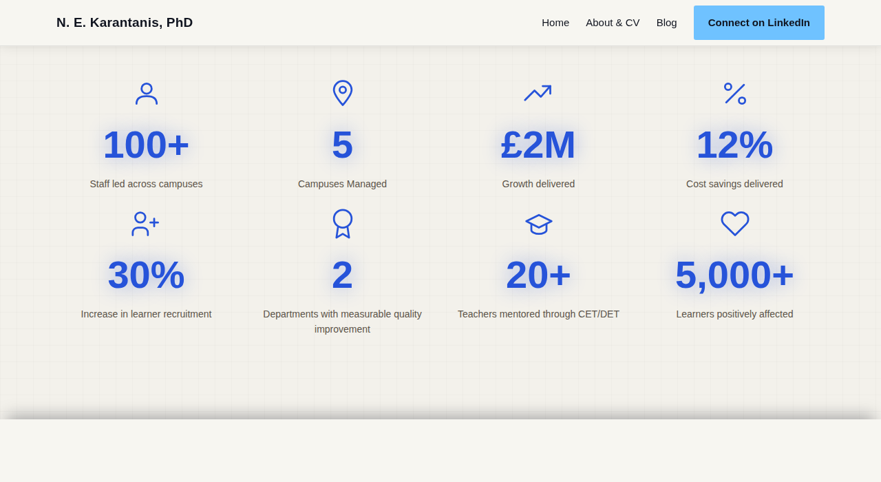
.section-light-dotted also carries a built-in top/bottom inset shadow, so it reads as a shallow recess when it’s sandwiched between two differently-toned sections (its original and still-primary use, Home’s Featured Roles between two .bg-c4 bands). A .dots-seamless modifier strips that shadow for the one place two .section-light-dotted sections instead sit back-to-back with nothing between them and are meant to read as a single continuous section rather than two stacked ones — the Blog page’s Featured Post + Post Grid, both dotted, no seam.
Most dark (and some light) dotted headers/sections also include {% include contour-lines.html %} as their first child — drifting SVG contour lines behind the content (see JavaScript). Not every dotted section has them, though: Home’s “From the Blog” section is plain .section-light-dotted with no contour lines at all, matching the flatter, quieter treatment of Areas of Focus rather than Featured Roles’ animated one.
Decorative blobs
Soft, semi-transparent circles (or free-form blob shapes) that drift slowly behind a header’s content — a bit of organic movement without competing with the text on top. Each page header that has one defines it as an inline <svg> with a dedicated position class:
<svg viewBox="0 0 200 200" class="about-header-blob">
  <circle cx="100" cy="100" r="100" fill="var(--nk-c1)"></circle>
</svg>
<svg viewBox="0 0 200 200" class="about-header-blob-2">
  <circle cx="100" cy="100" r="100" fill="var(--nk-c2)"></circle>
</svg>
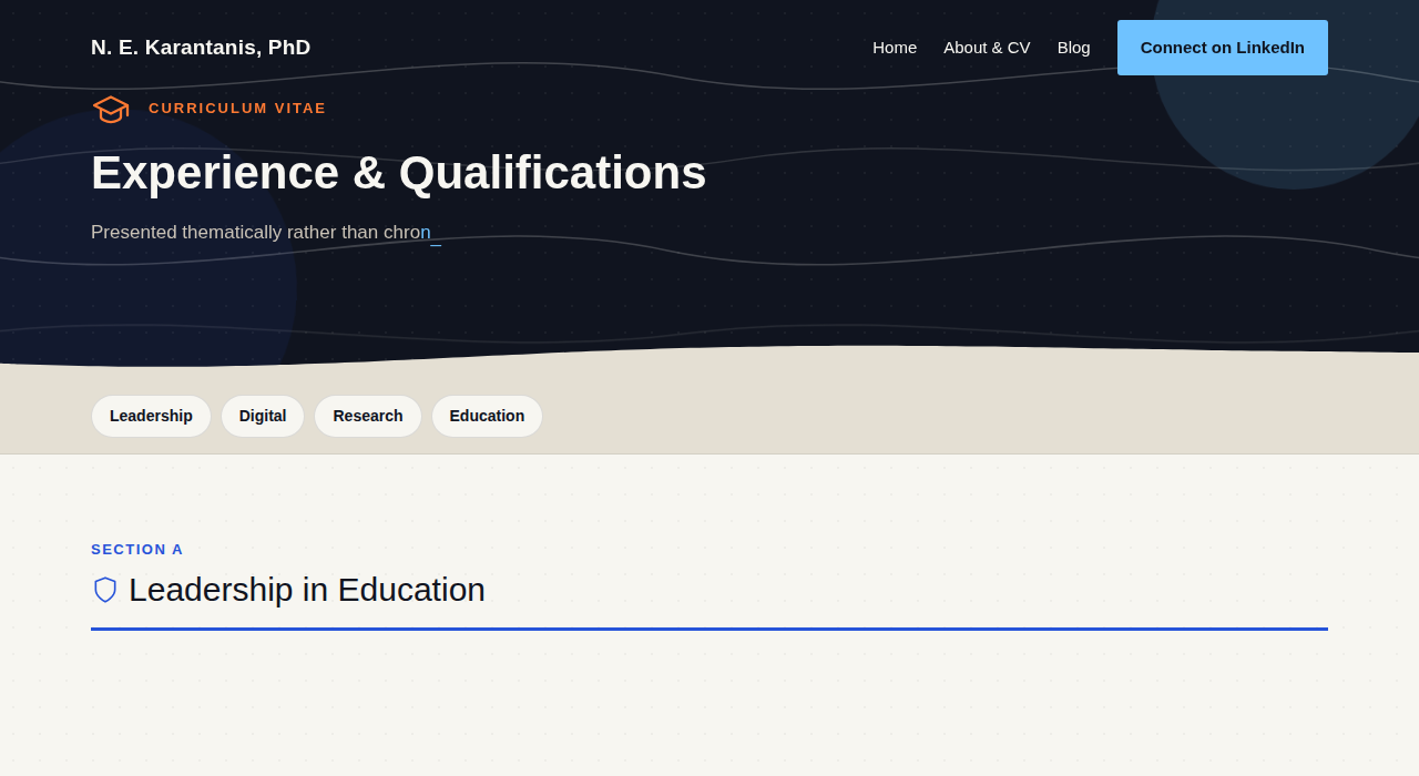
Every blob position class (.home-hero-blob-1/2, .about-header-blob/-2, .blog-header-blob/-2, .post-header-blob, .post-cta-blob-1/2) is just position: absolute with its own corner offset, size, and opacity — then all of them share one @keyframes blob-float animation (a 6-waypoint drift-and-scale loop), each given its own animation-duration and a negative animation-delay so a page with two blobs never has them moving in sync. The convention is one larger, more visible blob (opacity ~0.12) plus one larger but fainter second blob (opacity ~0.07–0.08) anchored to the opposite corner — visible on the About and Blog headers:
All blob animation is skipped under prefers-reduced-motion: reduce.
Wave dividers
The curved SVG shape at the bottom edge of a header or section, giving the straight edge between two background colors a soft, hand-drawn boundary instead of a hard line:
<svg class="wave-divider wave-divider--64" viewBox="0 0 1440 100" preserveAspectRatio="none">
  <path d="M0,40 C240,90 480,0 720,40 C960,80 1200,10 1440,50 L1440,100 L0,100 Z" class="fill-c3"></path>
</svg>
The base .wave-divider class is position: absolute; bottom: -1px with a default 44px height; --48, --56, and --64 modifiers adjust that. The path is filled with whatever color the next section is (.fill-c3, .fill-c4, .fill-c0 — matching utility classes to the palette above), so it reads as that section’s color curving up into the one above it. Every wave divider drifts gently side to side via site.js — see Wave dividers for how that animation works and the one case (the stats section) that needed a different approach.
div clipped to a wave shape via clip-path, not an SVG fill. That section's background is a grid, and a grid pattern squeezed through a wave divider's non-uniform SVG scaling renders inconsistently — full story in the JavaScript page.
Cards
Three card variants, all sharing .hover-card for the lift-on-hover behavior (translateY(-4px) + shadow):
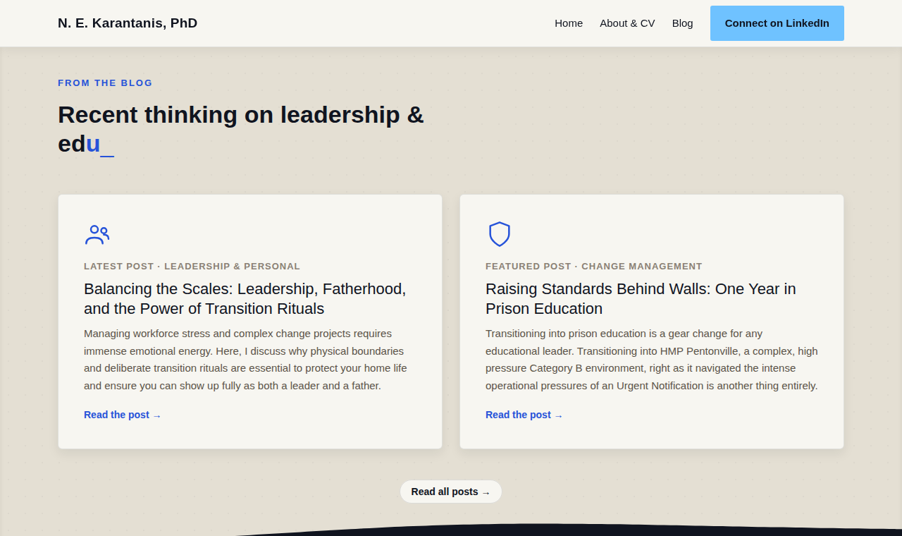
.post-card— blog grid cards: icon, category/date label, title, summary.role-card— company/logo cards on Home’s “Featured Roles”, reused as-is by “From the Blog” (icon in place of a logo, “latest”/”featured” label instead of a date range) so both sections share one visual language.featured-post-card— the Blog page’s single featured post, a two-column grid (icon, then text) rather than stacked
.pillar-card (Home’s “Areas of Focus”) and .info-card (About page’s highlighted current-role box) are simpler — a top accent border or flat background, no hover lift, since they aren’t links.

Icon draw-on
Every inline icon SVG on the site (the small stroke icons used in cards, pillars, and stat groups) can animate its strokes on to the page rather than just appearing — each <path>/<circle> reveals itself via a stroke-dasharray/stroke-dashoffset sweep, with each shape in a multi-shape icon staggered slightly after the last so the whole icon draws in like a quick sketch rather than snapping in at once. Icon groups with more than four shapes fall back to a plain fade instead (data-icon-fade-only) — animating that many strokes in sequence reads as sluggish rather than snappy, so past that threshold it’s simpler to just fade the whole icon in. The animation itself lives in site.js; see Icon draw-on for the mechanics.
Reading progress
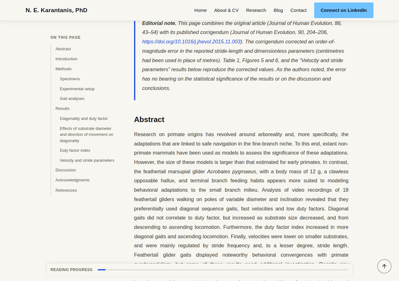
A small pill, fixed to the bottom of the viewport, that appears once a reader scrolls past the top of a blog post or publication article and fills a thin progress track as they read. It sits centered and width-matched to the article column beneath it (.post-body-inner on blog posts, the wider .pub-shell column on publication pages via the .reading-progress--pub modifier) rather than running edge-to-edge, so it reads as a status bar for that article specifically. On mobile it drops its label and background and becomes a bare, thicker line pinned to the very bottom edge — the only progress cue available at that width, so it needs to read clearly without any surrounding chrome.

Publication layout: TOC + article shell
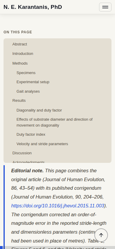
Publication pages (_layouts/publication.html) use a dedicated two-column shell, .pub-shell — a 220px sticky table-of-contents rail alongside a minmax(0, 1fr) article column, .pub-body. The TOC highlights whichever heading is currently in view as the reader scrolls (scrollspy, driven by site.js) and collapses to a single non-sticky column under 900px, where the whole nav becomes a tap-to-expand toggle (.pub-toc-toggle) instead of a permanent sidebar — there isn’t room for a rail alongside a comfortably-wide reading column at that width, and a full list of links would otherwise push the article down before a mobile reader ever reaches it.
Card/list view toggle
The Blog and Publications grids can both be switched between the default card layout and a denser list layout via .view-toggle-btn — a pill-shaped button styled like the filter dropdowns beside it, but filled solid with the blue accent rather than outlined, so it reads as an action rather than another filter. The chosen view persists only for the current page load; toggling it re-renders the grid and swaps the button’s own label/icon to reflect the new state.

Putting it together: the header pattern
Every page header on the site follows the same recipe, which is why they all feel like the same site despite different content:
<header class="section-dark-dotted text-c3 position-relative overflow-hidden">
  <svg class="about-header-blob">...</svg>
  <svg class="about-header-blob-2">...</svg>
  <div class="container position-relative page-header-inner">
    <!-- eyebrow, h1, intro paragraph -->
  </div>
  <svg class="wave-divider" ...>...</svg>
</header>
.section-dark-dottedfor the base texture, plus{% include contour-lines.html %}as the first child for the drifting contour lines- Two blobs, largest/most-visible one first
- Content wrapped in
.container.position-relativeso it stacks above the blobs (which arez-index: 0) without needing an explicitz-indexitself - A wave divider closing out the bottom edge, filled with whatever color comes next
The home hero, About header, Blog header, and every post header are all this same structure with different content and blob/wave color choices. When adding a new page header, start from an existing one and swap the content rather than building the pattern from scratch.
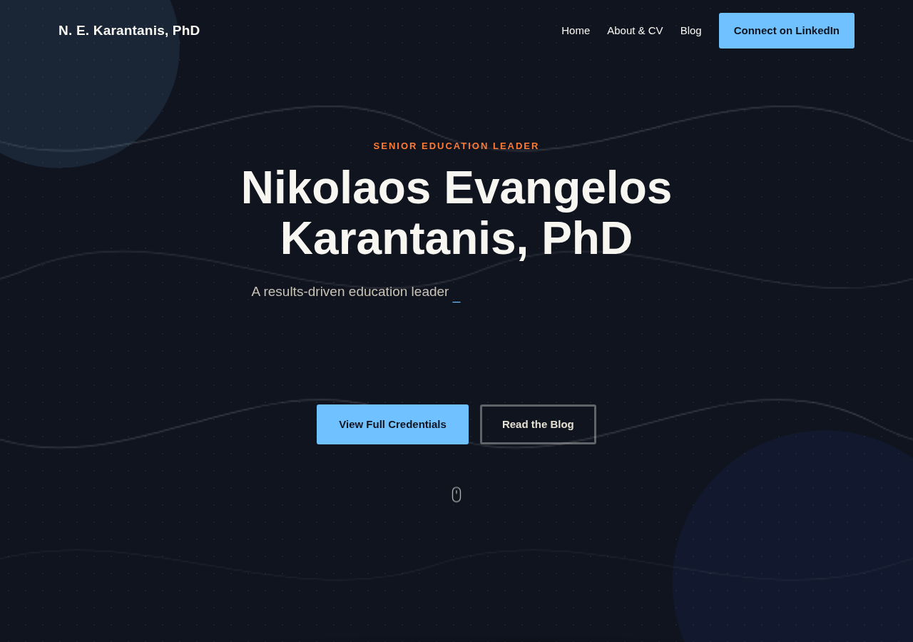
Content sections between headers alternate .bg-c4 (plain) and .section-white-dotted / .section-light-dotted to keep a long page from feeling flat, as seen across the About page’s four jump-linked sections (Leadership, Digital, Research, Education).
Back to top
.scroll-top (#scrollTopBtn) is a small fixed circular button, bottom-right, revealed once the page has been scrolled past ~600px. It’s injected once, sitewide, by _layouts/default.html — a standard part of the shared chrome rather than markup repeated per page — so every page gets it automatically and there’s nothing to remember when adding a new one.
Keyboard section nav + shortcut hint
Desktop visitors can step through a page’s major sections with ArrowLeft/ArrowRight — see Keyboard section navigation on the JavaScript page for the mechanics. A small keycap-cluster hint (bottom-left, #kbdHint) fades in briefly on any page the feature is active on, to surface it without being permanently on screen.