JavaScript
All animated behavior lives in one file, js/site.js, wrapped in a single DOMContentLoaded listener. There’s no framework and no build step — every system below is a self-contained block that finds its own elements via document.querySelectorAll, does nothing if it finds none, and (with one exception) is skipped entirely under prefers-reduced-motion: reduce rather than just running slower.
Hero intro sequence
The home page (hero_intro: true in its front matter, which adds class="home-hero-intro" to <body>) plays a staged entrance: background fades in, then the nav drops down, then the heading, then the two hero buttons and scroll hint cascade in one after another while the intro paragraph is mid-typewriter. The buttons slide in from opposite sides (.hero-btn-left from the left, .hero-btn-right from the right) so the pair reads as a symmetric duo rather than a single-file list. This part is pure CSS (@keyframes heroFadeIn, heroNavDrop, etc., each with its own animation-delay), scoped entirely to body.home-hero-intro so it never touches any other page’s shared nav.
animation-fill-mode: both so a button holds its final position during its delay instead of flashing into view unstyled. But fill-mode: both keeps the animation "in effect" on the transform property forever — which silently blocked the ordinary hover-lift transition every button on the site has, since two rules were fighting over the same CSS property. The fix, in site.js, listens for animationend on each hero button and sets el.style.animation = 'none' once the entrance animation genuinely finishes, releasing the property back to the normal :hover transition. It carefully skips this for .scroll-hint while its infinite bounce animation is still the one running, checking e.animationName === 'scrollBounce'.
Scroll reveals
Three attribute selectors ([data-reveal], [data-reveal-grid], [data-reveal-split]) opt an element into fade/slide-up-on-scroll. A single IntersectionObserver (falling back to “just show everything” if the browser doesn’t support it) adds .is-visible the first time each element enters the viewport, then stops observing it — the animation only ever plays once per page load.
[data-reveal-grid] additionally gets a direction computed at runtime rather than hardcoded: assignRevealDirections() groups each grid’s children by their rendered offsetTop (i.e. which row they landed in after the browser wraps the grid), sorts each row by offsetLeft, and marks the first item left, the last item right, and anything else up. This re-runs on window resize (debounced 150ms) and whenever the Blog page’s filters change which cards are visible — so a 4-column row that becomes a 2-column row on a narrower viewport (or a filtered-down set of cards) still gets a sensible per-card direction instead of an assumption baked in at author time.
Typewriter effect
Any element with [data-typewriter] — including every blockquote pull-quote inside a post body, tagged automatically via document.querySelectorAll('.post-body-inner blockquote p') — has its text revealed one character at a time once it scrolls into view (again via IntersectionObserver, threshold: 0.1).
Implementation notes worth knowing if you’re touching this code:
- Every character is laid out up front as an invisible
<span class="tw-char tw-char--pending">so the element already occupies its final width/height from frame one — this keeps centered headings anchored in place instead of visibly growing outward as text fills in. - The blinking
_cursor is a separately positioned absolute element that’s repositioned after each character (placeCursor), rather than an inline character in the text flow — an inline cursor occasionally pushed a line just over its wrap width, causing a visible stutter as a word jumped to the next line and back. - The just-typed character sits in the accent color (
.tw-char--accent) until the next one appears, then settles to the normal text color. data-tw-delay="850"on an element (used on the home hero’s intro paragraph) delays the start so it can be timed against the hero’s own staged entrance rather than firing the instant it’s visible.data-tw-staticon an element (used on CTA headings) skips the letter-by-letter reveal but keeps the trailing blinking cursor as a small decorative touch — full text is written in immediately, with the same_cursor span appended right after it, no per-character timeline runs at all.- CSS hides
[data-typewriter]text by default (.js-tw [data-typewriter] { opacity: 0; },.js-twbeing added by an inline<script>in<head>before anything renders) so there’s never a flash of the full static text before the effect takes over — and if JavaScript is disabled entirely, the.js-twclass never gets added, so the plain text just shows normally.
Icon draw-on
Icons inside .stat-icon and .post-card-icon (the small stroke SVGs used across stat groups, post cards, and pillars) draw their strokes on rather than just appearing, via stroke-dasharray/stroke-dashoffset: every shape starts fully “undrawn” (dashoffset set to its own getTotalLength()), then transitions to 0 once the icon scrolls into view (IntersectionObserver, threshold: 0.6).
Two tiers keep this from reading as busy on compound icons or tiny shapes:
- Per-shape stagger (
SHAPE_STAGGER_MS, 90ms) — a multi-shape icon (e.g. “team”: circle+path+circle+path) draws one shape after the next rather than all four at once. - Per-icon stagger (
ICON_STAGGER_MS, 130ms) — whichever icons the observer reports intersecting in the same callback batch (a whole row of stat icons entering together) are also offset from each other, both for visual calm and to spread out the real paint cost of several icons redrawing their stroke every frame at once.
Two fallbacks skip the draw animation entirely in favor of a plain fade:
- Any individual shape under 10px of path length (
NO_DRAW_LENGTH) — a growing arc that short reads as a flicker, not a draw. - Any icon with more than 4 shapes (
MAX_ANIMATED_SHAPES) — the “tree” icon (4 branches + 4 leaf dots) kept reading as frantic no matter how it was staggered, so past that shape count the whole icon just fades in together instead. - Any icon inside a
[data-icon-fade-only]container (used on Publications’ “By the Numbers” row) opts out of drawing entirely, even for simple icons — a lone simple icon drawing on next to a compound one popping/fading on its own timeline read as mismatched, so the whole section is fade-only as a group.
Stat counters
Every [data-count-to] inside a [data-count-group] (the Home page’s “By the Numbers” row) counts up from 0 together, sharing one shared start timestamp and a fixed 1400ms duration with an ease-out-cubic curve — so a counter going to 5 and one going to 5,000 both land on their final value at exactly the same moment rather than the small number finishing first and just sitting there. data-count-prefix/data-count-suffix (e.g. £ / % / +) wrap the animated number, and values ≥1000 get toLocaleString('en-GB') comma formatting applied each frame. Once every counter in the group lands, each gets a quick statPop scale-bounce (.count-done) as a small “landed” punctuation mark.
Wave dividers
Every svg.wave-divider path gets a continuously-animated, gently drifting shape — a smooth spline (Catmull-Rom converted to cubic Bezier, smoothPath) through a handful of sine-wave-offset points, redrawn every frame by rewriting the path’s d attribute. Each divider is seeded from its index using the golden ratio (i * 0.618...) so a page with several dividers gets well-scattered, never-quite-synchronized phases, speeds, and amplitudes rather than looking copy-pasted. Scrolling temporarily speeds the drift up to ~6x (VELOCITY_FOR_FULL_BOOST), easing back to the normal slow pace once the scroll gesture actually stops (a debounced idle timer, not just “last event”). Each wave is also gated by its own IntersectionObserver — one that’s scrolled off-screen stops being redrawn every frame until it’s back in view.
<path> filled with a tiled grid <pattern> to match. That approach turned out to be fundamentally unreliable: the wave SVG uses preserveAspectRatio="none" to stretch non-uniformly to the page width, which also stretches anything filled inside it — squeezing thin, low-opacity grid lines through that distortion anti-aliased most of them into invisibility, leaving only a fraction of the lines actually visible and reading as a coarse, misaligned grid.
The fix moves the grid onto a plain
<div class="stats-wave-fill"> with a real, undistorted CSS background-image grid (identical technique to .section-light-grid below it), clipped to the wave silhouette via an SVG <clipPath clipPathUnits="objectBoundingBox"> instead of an SVG fill. To keep this one wave animating like all the others, buildWavePath() takes a normalized flag: when set, it builds the exact same 1440×100-space curve everyone else uses, then scales every point down to the 0–1 range objectBoundingBox expects (and raises decimal precision from 1 to 4 places, since 0–1 numbers need much finer resolution than 0–1440 ones to look smooth). The background grid itself never moves — only the clip shape drifts — so the grid stays perfectly aligned with the section below regardless of the animation.
Contour-line backgrounds
Dark (and the one light) dotted sections carry a drifting contour-line background instead of any JS-driven animation — _includes/contour-lines.html renders a .contour-bg div holding an SVG with 3–4 open (unfilled) wave paths, reusing the same curve family as .wave-divider. Each path is one 1440-unit period drawn twice across a 2880-wide viewBox; a CSS @keyframes animation translates it by exactly -50% (one period) on an infinite loop, so the seam where it repeats is invisible. preserveAspectRatio="none" plus height: 100% on the SVG let the same 0–100-unit paths stretch to whatever height the section actually renders at.
Because the only animated property is transform, the browser composites this on the GPU with no per-frame JavaScript at all — prefers-reduced-motion: reduce is handled with a plain CSS rule (animation: none) rather than a JS check, so it also responds if the setting changes mid-visit. The include takes two params: variant="hero" adds a fourth, faintest line for tall page headers (variant omitted/anything else gives the 3-line “compact” set for CTA-sized sections), and tone="light" switches the stroke to a low-opacity ink color for the one section with a light background (.section-light-dotted) instead of the light ink used everywhere else.
One easy-to-miss requirement: the section’s actual content wrapper needs its own stacking context above .contour-bg (position: relative and an explicit z-index, e.g. the z-1 utility) — position: relative alone leaves z-index: auto, and a non-positioned descendant of that wrapper can still end up painted behind a later position: absolute sibling like .contour-bg, regardless of DOM order. Every section using this include already has z-1 on its content container for exactly this reason.
Blog category/tag filtering and live search
The category and tag dropdowns on the Blog page are custom button+list widgets, not <select> elements — a native select’s open popup is browser chrome that can’t be restyled to match the theme. setupDropdown(root, onSelect, onClear) wires up one dropdown: a trigger button, a role="listbox" menu, and a small × button that only appears once a value is picked (living inside the same pill as the trigger, not a separate “clear all” button).
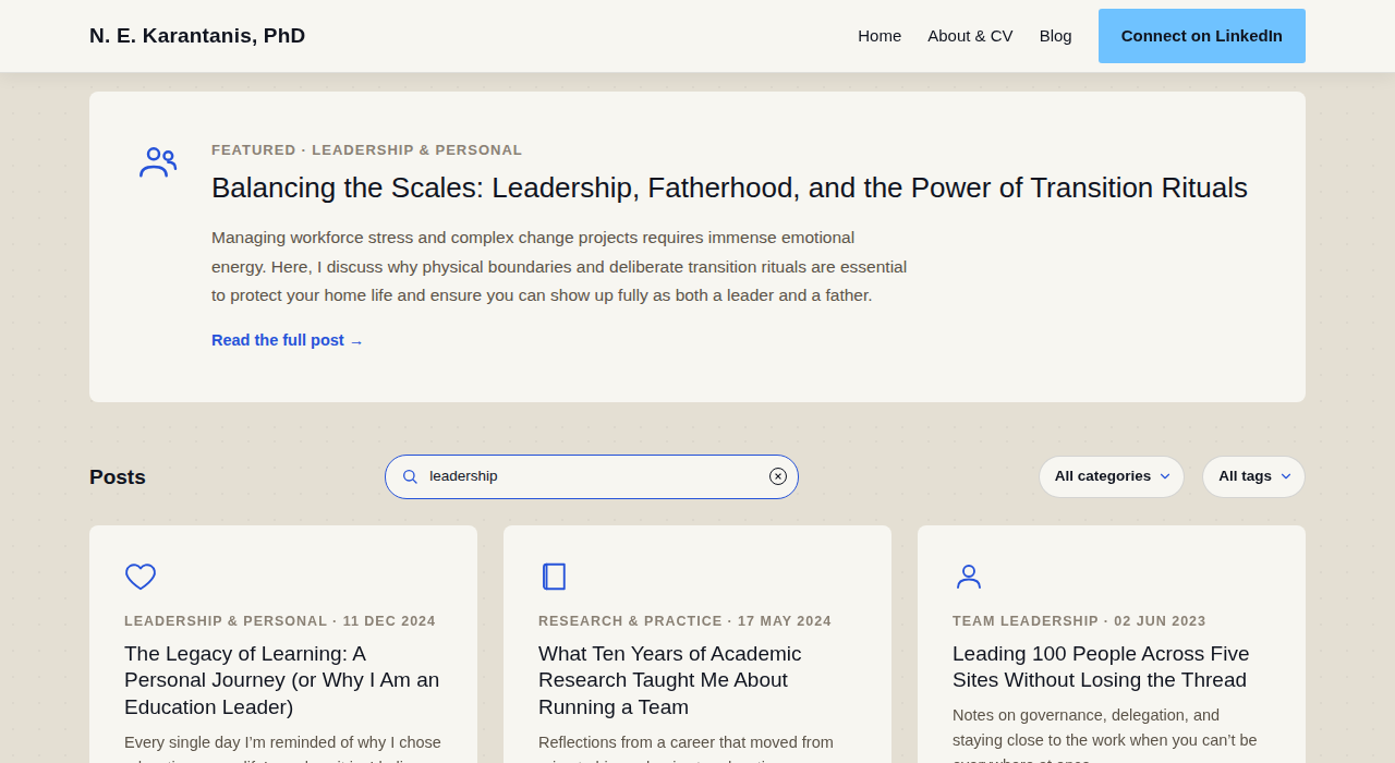
A text search box sits alongside the two dropdowns and filters the same grid live, on every keystroke (input event, no debounce needed — it’s a plain array of ~10 cards). Each card carries a data-search attribute that Liquid bakes at build time from its title, summary, category, and tags (lowercased, HTML-stripped), so matching at runtime is just card.dataset.search.includes(query) — no DOM text extraction on every keystroke. All three filters (category, tag, search) combine with AND: a card only shows if it passes all of the currently-active ones.
Filtering itself just toggles .d-none on each post card client-side and re-runs assignRevealDirections() since the visible set (and so each card’s row) just changed; an empty result shows a “No posts match that filter” message. The current category/tag/search state is mirrored into the URL query string (syncUrl, via history.replaceState, search as ?q=) so a filtered view is shareable/bookmarkable, and read back out on page load. The featured post at the top is never affected by any of this filtering — it’s shown unconditionally, independent of the grid below it.

Reading progress
readingProgress/readingProgressFill (present on blog post and publication pages only, injected by _layouts/default.html) track scroll position against the article body itself — .post-body-inner or .pub-body — rather than the whole document, re-measured fresh on every scroll/resize tick rather than cached once at load (a post’s lazily-loaded featured image can still be growing the article’s height for a moment after the page first settles, and a stale measurement would throw off exactly where “100%” lands). 0% is the article’s own first line, 100% is its last; the pill is visible once the reader has scrolled past 80px and hides again 80px past “done” (REVEAL_PX), so it doesn’t sit fixed over the CTA/footer once there’s nothing left to track. See Reading progress on the Sections & Components page for the visual/layout side.
Card/list view toggle
setupViewToggle(btn, grid, storageKey) wires up one button+grid pair, cycling through VIEW_MODES (card, list) on click: it sets grid.dataset.view (which CSS keys its layout off), updates the button’s own label, and re-runs assignRevealDirections() since switching modes reflows every card into new rows/columns. The Blog (postViewToggle/postGrid) and Publications (pubViewToggle/pubGrid) grids each get their own instance with their own localStorage key (nk-blog-view, nk-pub-view), so a visitor’s chosen view for one page doesn’t affect the other, and persists across page loads via localStorage (falling back silently if storage is unavailable, e.g. private browsing).
Publication TOC: scrollspy and mobile collapse
The publication article TOC (#pubTocList) is built from the article body’s own h2/h3 elements rather than a hand-maintained list — kramdown already assigns each heading a stable id, so the script just walks #pubBody h2[id], #pubBody h3[id] and generates one link per heading (h3s get a .pub-toc-h3 class for the extra indent).
Which link is highlighted as “active” is not driven directly by IntersectionObserver’s isIntersecting — that approach made a heading’s link go dark again the moment the heading scrolled past a fixed activation band, well before the reader had actually finished that section. Instead, every time any heading crosses an 88px-from-top activation line, the whole set is recomputed: the last heading whose top has scrolled above that line is the active one, and it stays active for that section’s entire length until the next heading crosses.
Below 900px, the same TOC collapses into a single tap-to-expand toggle (#pubTocToggle / #pubTocInner, CSS-driven via .is-open), since the sticky sidebar layout drops out entirely at that width (see the .pub-shell layout). Tapping a link inside the open list also closes it again, so a reader who jumps to a section isn’t left with the list still covering the top of the article they just navigated to.
Contact form
The Contact page’s form posts to Formspree; js/site.js progressively enhances that plain POST-and-redirect into an in-page fetch submit so a successful send shows an inline confirmation message instead of leaving the page. On success it resets the form and shows a thank-you message; on a rejected submission it reads Formspree’s error response (which comes back in one of two different shapes depending on the failure — a { errors: [{ message }] } array for validation failures, or a single { error } string for account-level rejections) and surfaces whatever Formspree actually said rather than a generic fallback. If fetch itself fails (e.g. no network), the form still works via its native action/method, a real page navigation.
Nav scroll state
site.js toggles .scrolled on #siteNav once window.scrollY > 24, which is what switches the nav from transparent-over-the-hero to a solid background with the logo/links flipping from light to dark text (all handled in CSS via .site-nav.scrolled variants). It also keeps a --nav-h CSS custom property in sync with the nav’s actual rendered height (recalculated on scroll and resize, and genuinely different before/after .scrolled since the nav’s own padding shrinks) — used by .section-subnav’s top: var(--nav-h, 69px) so the About page’s sticky jump-nav sits flush under the main nav at any width rather than at a hardcoded offset. A second, analogous --subnav-h is synced from .section-subnav itself where one exists (About only) — see Keyboard section navigation below for why a second page-specific offset matters, on top of the nav’s own.
Keyboard section navigation
ArrowRight/ArrowLeft step through a page’s own major sections on desktop — marked per layout with [data-kbd-stop] — interleaved with any finer-grained sub-stops that exist on that page: the top of each company/workplace entry on the About page (so the reader lands on its description first) followed by each of its job-role entries (.info-card/.subrole), and each on-page-TOC heading inside a publication’s body (#pubBody h2[id], h3[id]). Interleaving all of these into one list sorted by page position, rather than keeping them separate, is what makes “next section” and “next workplace”/”next job role”/”next heading” the same keypress — pressing right just walks to whatever the next stop down the page happens to be, section or sub-stop alike. Blog posts have no sub-stops (no post currently uses ## headings), so they naturally get plain section-to-section stepping only.
The handler is disabled while focus is in a text input, textarea, select, or contenteditable element (so it never hijacks typing in the Contact form or Blog search box), and skips entirely if any modifier key is held. Every [data-kbd-stop], .info-card, .subrole gets scroll-margin-top: calc(var(--nav-h, 69px) + var(--subnav-h, 0px) + 16px), so scrollIntoView() clears the fixed nav — and, on the About page, the sticky section-subnav sitting below it too — instead of landing a heading half-hidden underneath either bar.
On each keypress it recomputes every stop’s position fresh (the same “recompute on every check” approach as the publication TOC’s scrollspy, rather than trusting a cached position) and finds the “current” stop as the last one whose effective position — getBoundingClientRect().top minus that same element’s own live scroll-margin-top, read via getComputedStyle rather than re-derived — is at or above a small, fixed slack (REACHED_SLACK, 20px). Reading each element’s actual computed scroll-margin-top, instead of replicating the --nav-h/--subnav-h arithmetic separately in JS, matters for a subtle reason: --nav-h itself shrinks a beat after a jump completes, once the resulting scroll event pushes the nav past its own .scrolled threshold. An activation check that re-derived the offset from the current (now-smaller) nav height, rather than asking what scroll-margin-top the browser had actually used, would find the stop it just landed on suddenly reads as “not yet reached” and re-select it — the next keypress landing you nowhere.
Pages with zero [data-kbd-stop] elements (Contact, Privacy, the docs site) don’t wire up the listener at all, so arrow keys keep their unremarkable native behavior there.
Keyboard-shortcut hint
A small “arrow keys” hint (#kbdHint, injected sitewide by _layouts/default.html) fades in about 900ms after load, and afterwards tracks scroll direction: it fades out the moment the visitor scrolls down or actually presses ArrowLeft/ArrowRight, and fades back in on any upward scroll — the same hide-on-scroll-down/show-on-scroll-up idea as a lot of mobile browser chrome, rather than sitting on screen (or gone for good) regardless of what the visitor’s doing. It only ever shows on a page that has [data-kbd-stop] elements, so it never advertises a shortcut that wouldn’t do anything there. Hidden entirely under 900px width and on coarse/no-hover (touch) input via CSS media queries, since physical arrow keys aren’t the relevant input there regardless of viewport width.
While visible, the whole box plays a gentle infinite bounce (kbdHintBounce, translateY 0↔4px) so it registers as “here’s a thing you can press” rather than just static chrome — the same idea as the home hero’s .scroll-hint mouse-scroll indicator. The bounce lives on an inner wrapper (.kbd-hint-inner, wrapping the keycaps and text together) deliberately: the outer .kbd-hint already owns opacity/visibility for its own fade transition, and if the same element also owned a looping transform animation, the two would have to coexist on one element’s style — keeping them on separate elements avoids that entirely, the same reasoning as the hero buttons’ entrance animation once silently blocking their hover lift (see the hero-intro-sequence note above). Skipped under prefers-reduced-motion: reduce, same convention as the hero’s own bounce.
Comments iframe resize
Cusdis (#cusdis_thread, see Reference for _includes/cusdis.html) embeds its widget in an iframe with no fixed height of its own. site.js listens on window for a message event carrying a height (top-level, or nested under data) alongside something identifying it as coming from Cusdis (context: 'cusdis', type: 'cusdis-resize', or an origin containing cusdis), and sets the iframe’s style.height directly from it whenever one arrives — so the widget grows and shrinks with its actual content (fields expanding, comments loading in) instead of scrolling internally. A min-height: 250px in custom.css only covers the gap before that first message arrives; it’s deliberately too short for a real comment thread, so it gets out of the way immediately once one exists. The exact message shape Cusdis sends isn’t documented anywhere public — this was inferred, so it may need revisiting if a Cusdis update changes it.
Blog post read count
The #postReads element (only present in the page at all once site.pageviews.worker_url is set — see Reference) carries its fetch target and the current page’s path as data-pageviews-url/data-page-url attributes, since site.js is a plain static file with no access to Jekyll’s site.* config at runtime. On load, site.js fetches <worker_url>/pageviews?url=<page path> and, if the response has a numeric views field, sets the element’s text to e.g. “128 reads” (or “1 read”). Any failure — the fetch rejecting, a non-OK response, an unexpected body — is swallowed silently, leaving the element empty; custom.css hides it entirely while empty (.post-reads:empty { display: none; }) and only adds its leading “· “ once it has real text (.post-reads:not(:empty)::before), so a slow or failed fetch never leaves a dangling separator or a stuck “0 reads”.